User Experience Design
Content Strategy
Visual design
Discovery and Interviews
Project management
My Role
As a senior ux designer for a pain management eco-system, I conduct user testing, create a detailed content strategy, create wireframes and prototypes and work with developers to create design in code. I work with product managers and senior leadership to gather user requirements, create new designs, and enhance existing features.
Case Study
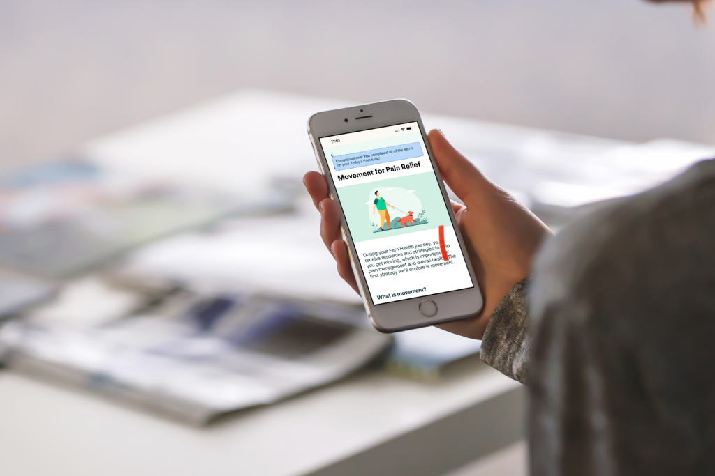
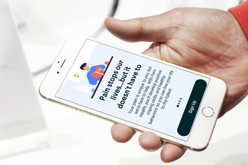
We aimed to design a comprehensive pain management ecosystem to help users track, analyze, and manage chronic pain. This ecosystem includes a web-based application guided by a real pain coach.
Research
We conducted interviews with individuals experiencing chronic pain to understand their challenges, pain types, and existing coping mechanisms.
Personas
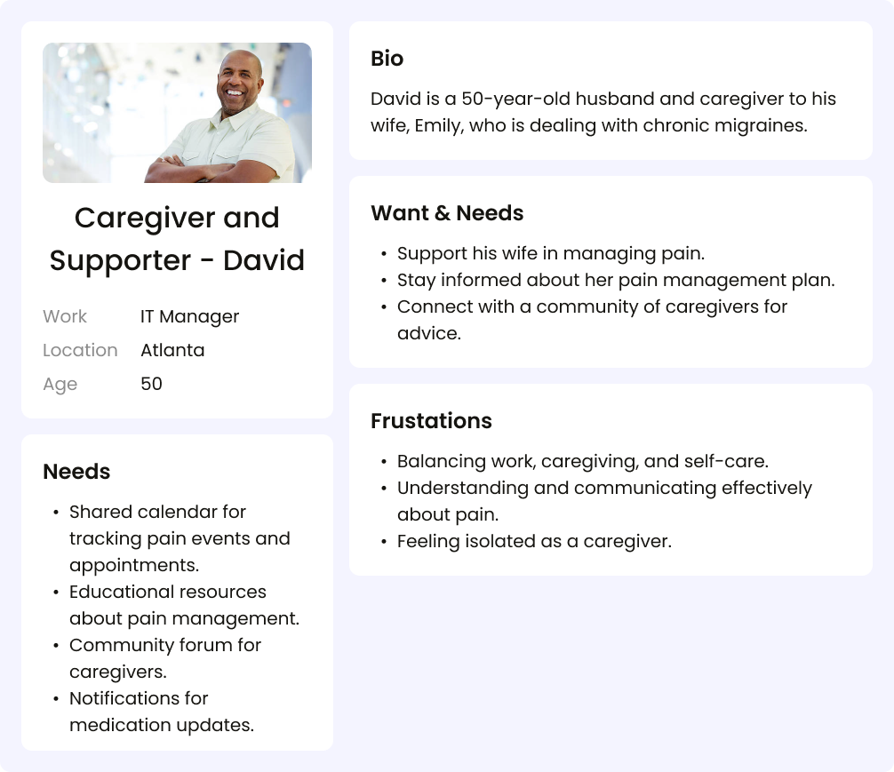
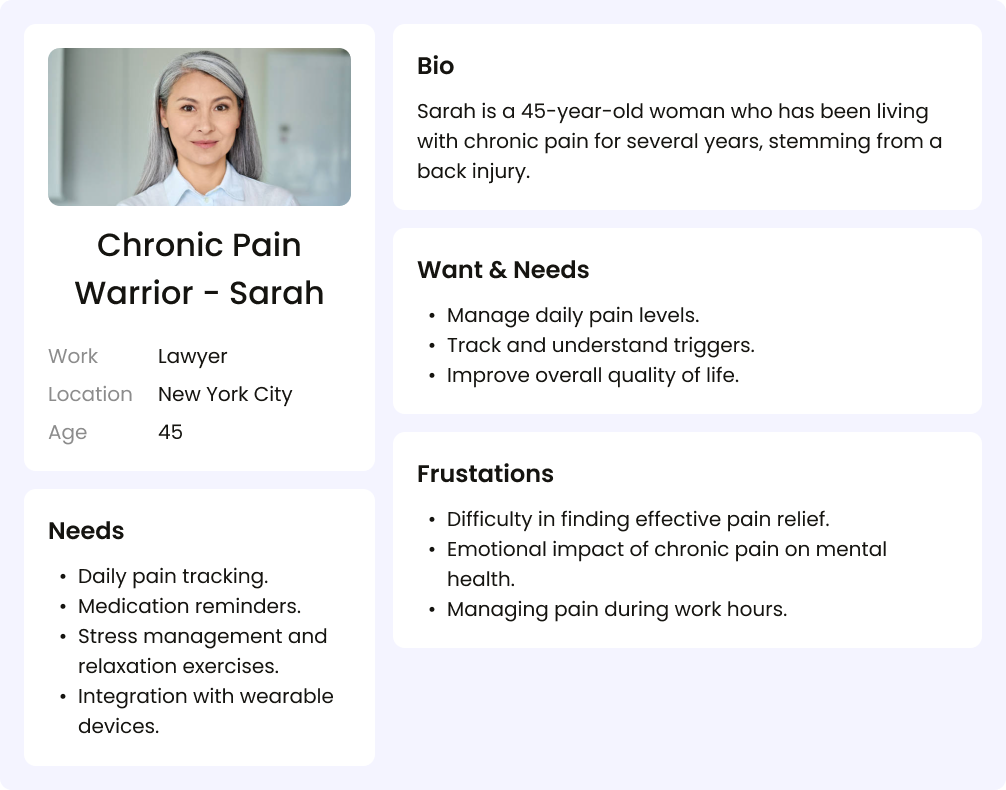
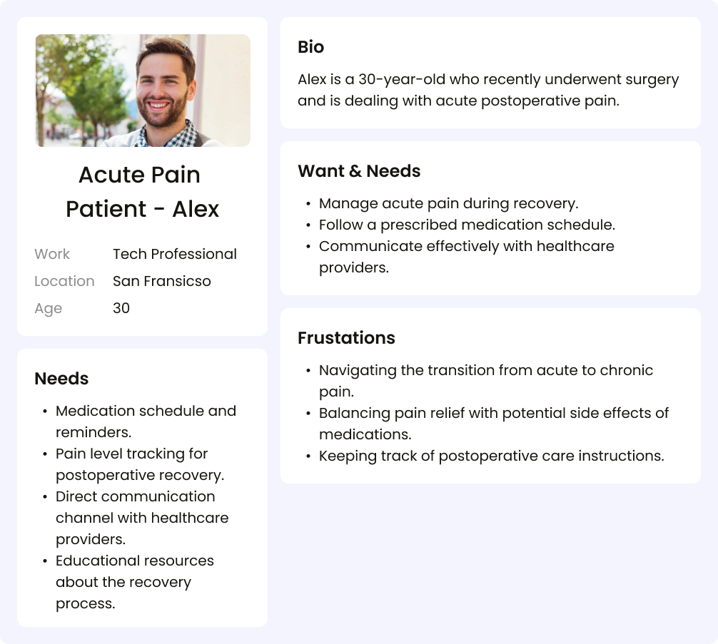
The ux team created detailed user personas based on research findings to represent the target audience, including their pain levels, lifestyle, preferences, and technology proficiency.
User Journey Mapping
We continuously mapped out the user’s journey from pain identification to relief, identifying touchpoints for interaction.
Information Architecture
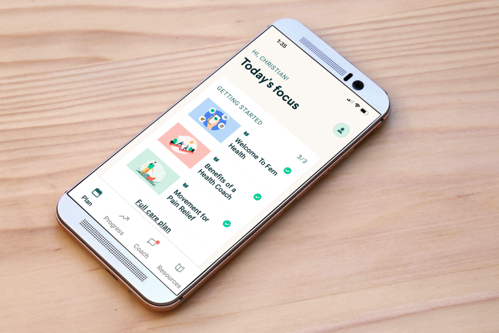
We created a clear and intuitive information architecture for the app, organizing features into logical categories. Consider the following main sections:
- Coaching assignment/introduction
- Reminders
- Insights and Analytics
- Resources (Articles, Tips, etc.)
- Exercises
- Settings
Wireframing
We developed low-fidelity wireframes to outline the app’s structure and basic functionality. Focus on simplicity and ease of navigation.
Prototyping
We Built interactive prototypes using Figma to demonstrate the flow and functionality of the app. Test prototypes with potential users for feedback.
Visual Design
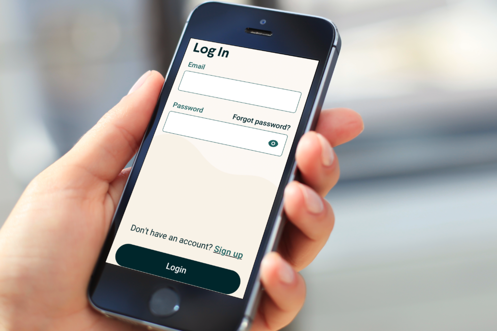
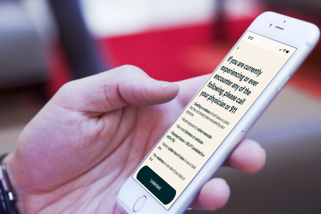
Based on a robust design library, we created a visually appealing and user-friendly interface:
- Choose a soothing color scheme.
- Use legible fonts.
- Design intuitive icons and buttons.
- Ensure accessibility features for users with disabilities.
Feedback Mechanism
Implement user feedback mechanisms, such as surveys or in-app feedback forms, to continuously improve the app.
Accessibility
As a critical element and requirement, accessibility is a part of every feature, enhancement, and iteration. We continuously test the application is accessible to users with various abilities:
- Implement voice commands.
- Clear language and instruction
- Consider contrast and font size for readability.
Testing
We conduct usability testing with diverse users to identify and address any issues with the app’s functionality and design.
Support
We continue collecting user feedback and iteratively improve the app based on user suggestions. Regularly update the app with new features and improvements.

