I created a comprehensive design system in Figma to streamline the design and development process in my role as a product designer. The primary goal of this design system is to ensure consistency, efficiency, and a seamless user experience across all our digital products and platforms. This case study outlines the development and impact.
Background
Before the creation of this design library, we were facing significant challenges in maintaining a consistent user experience across multiple features and platforms, leading to confusion among users and higher development costs. Design inconsistencies, varying design languages, and the lack of shared components were identified as the main pain points.
Objectives
I was tasked to create a unified design language that represents the brand identity. Also to provide a central repository of design guidelines and UI components. I wanted to improve collaboration between designers and developers as well as reduce design and development time by reusing components.
Process
Research and Analysis: I analyzed existing assets and identified common design patterns and inconsistencies. I also interviewed designers, developers, and stakeholders to gather their input and pain points.
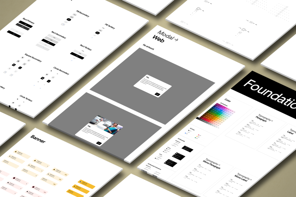
Design Language: We developed a cohesive design language that reflected current brand values and personality. This included defining color palettes, typography, iconography, and the overall visual style.
Component Library: A central library was created, containing reusable elements such as buttons, forms, navigation menus, and cards. Each component was documented with clear guidelines, usage examples, and code snippets.
Documentation: I developed extensive documentation that provided guidelines on design principles, accessibility, and usability standards. This documentation was made available to all team members through Confluence
Development Integration: The design system was integrated into the development workflow. Developers could easily access the component library and directly implement elements into their projects, reducing the need for custom coding.
Testing and Iteration: Continuous testing and feedback were solicited from testers and developers to identify any issues or improvements needed. The design system was iterated upon based on this feedback.
Impact
Consistency: The design system ensured a consistent look and feel across all features, improving user trust.
Efficiency: Designers and developers save time by using the pre-built components, reducing development time and costs.
Collaboration: Collaboration between designers and developers improved as they shared a common design language and component library, leading to smoother project workflows.
Scalability: The design system allowed for easy scalability as new features and products were developed, ensuring a uniform user experience
Accessibility: Standards are built into the system creating an inclusive well-rounded product.